My Work
A lot of my work is rooted in behaviour and lifestyle, thinking about where something exists and why it matters, rather than just what it looks like. I like projects that let me explore this properly, especially across branding, product, and digital design.
Projects

Rough & Tumble
Rough and Tumble is a beer brand for an active, younger audience, shifting drinking culture from the pub into an outdoor, lifestyle-led space. Built around “the push and the pause,” it combines a light, citrus-led product with a cohesive brand system designed for real, social moments.

Big Round Circle
Big Round Circle introduces a digital legacy app designed to create a more thoughtful way of communicating. It allows users to write messages, record voice notes, and store memories to be delivered in the future - whether at specific dates, personal milestones, or moments they may not be present for.

Nimbus
Weather apps tell you what’s happening. This one tells you what it means. Most forecasts stop at numbers and icons, but they don’t reflect how weather actually feels. This app translates conditions into their impact on the body - energy, pain, and clarity - making the forecast more personal and useful.


UAUK
UAUK is a charity concept developed as an extension of Drinkaware, focused on addressing everyday drinking habits in adults aged 55–74. I created a full campaign and design system aimed at reducing binge drinking in a way that feels non-judgemental and approachable, shifting the focus away from stigma and towards awareness and small behavioural change.
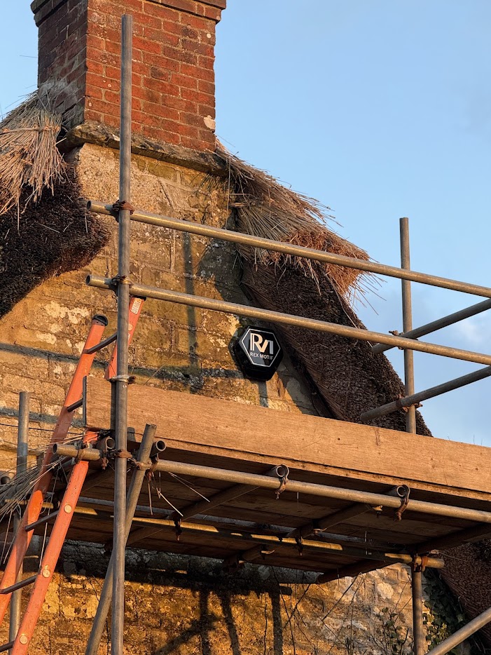
Rex Motif
Rex Motif is a digital support company offering tech solutions for both personal and business clients, from home Wi-Fi installations and security systems to full business platforms powered by Microsoft SharePoint. I worked closely with the founder, Hugo, to design a visual identity that reflected the brand’s clean, sharp, and professional approach.

Ginger Gerbil
Ginger gerbil is a british made ginger based spriit. The project included developing two label systems — one for the main bottle and one for the mini range — ensuring consistency while adapting to different formats. Alongside this, I designed the full website, creating a cohesive brand experience across both physical and digital touchpoints.

Castlight
Castlight is an independent real estate advisory firm based in Brussels, working across investment, development, and portfolio management in the European property market. As part of their relaunch, I was asked to design a full visual identity that felt confident, modern, and professional, without falling into the typical corporate clichés.
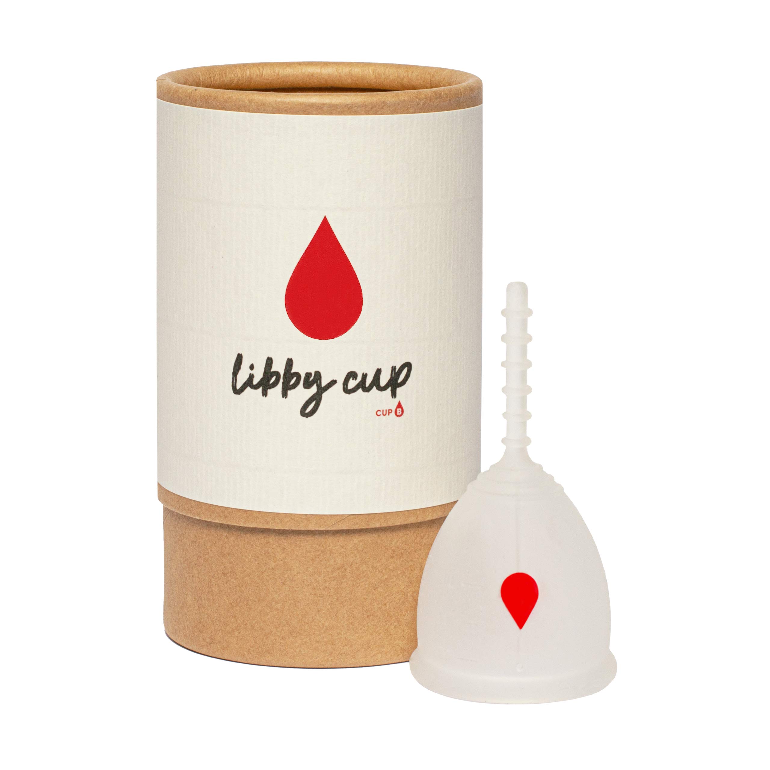
Libby Cup
Castlight is an independent real estate advisory firm based in Brussels, working across investment, development, and portfolio management in the European property market. As part of their relaunch, I was asked to design a full visual identity that felt confident, modern, and professional, without falling into the typical corporate clichés.


Bean Band
The Bean Band is a coffee company originally launched under a different name, with an established brand that no longer reflected its direction. As part of a full refresh, I worked closely with the founder to develop a new identity that felt more current, playful, and aligned with the product.


.svg)