UAUK
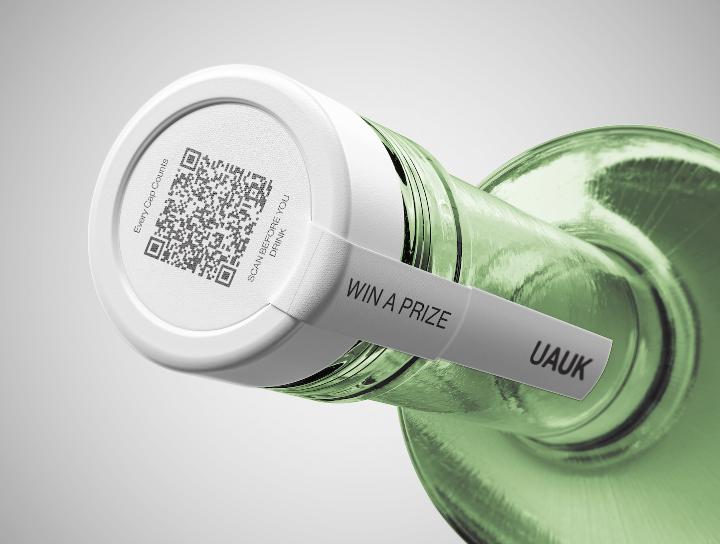
Weather apps tell you what’s happening. This one tells you what it means. Most forecasts stop at numbers and icons, but they don’t reflect how weather actually feels. ThisUAUK is a charity concept developed as an extension of Drinkaware, focused on addressing everyday drinking habits in adults aged 55–74.
I created a full campaign and design system aimed at reducing binge drinking in a way that feels non-judgemental and approachable, shifting the focus away from stigma and towards awareness and small behavioural change. app translates conditions into their impact on the body - energy, pain, and clarity - making the forecast more personal and useful.
DRPG
Web, Branding, Campaign & Advertisment
Illustrator, XD, Photoshop, Canva Video


Behind the Design
For this brief, I was asked to explore typography across different environments, so I chose to develop it within an app context. I liked the idea of working digitally, where typography has to be clear, functional, and responsive.
I based the concept around weather, but wanted to approach it in a more personal way. The idea came from hearing my mum talk about her knees hurting when the air pressure changes, which made me realise how differently people experience weather beyond just temperature or rain.
This became the direction for the app - combining data with human experience, using typography to communicate changes in a way that feels more relevant and intuitive.
It allowed me to explore how type can shift in scale, weight, and hierarchy to reflect different conditions, making the information not just readable, but more expressive and connected to real life.

.svg)