Insights
This is where I write about design as I go — what I’m noticing, what I’m learning, and what I think works (or doesn’t). It’s less about finished outcomes and more about the thinking behind it.
BLOGS


Perfectly Imperfect: Why “Bad Design” is Suddenly So Good
Alix Earle’s new brand, Relé Active, is a really interesting example of where branding feels like it’s heading right now — less polished, more personal, and intentionally imperfect.At first glance, the design feels simple. There’s a softness to it, a slightly...

Where’s the Best Place for Website Design Inspiration?
When starting a website or app project, one of the first questions is always the same - where do you actually go for inspiration?There are loads of platforms out there, but for me, Mobbin has been one of the most useful. Instead of just showing polished homepage ...
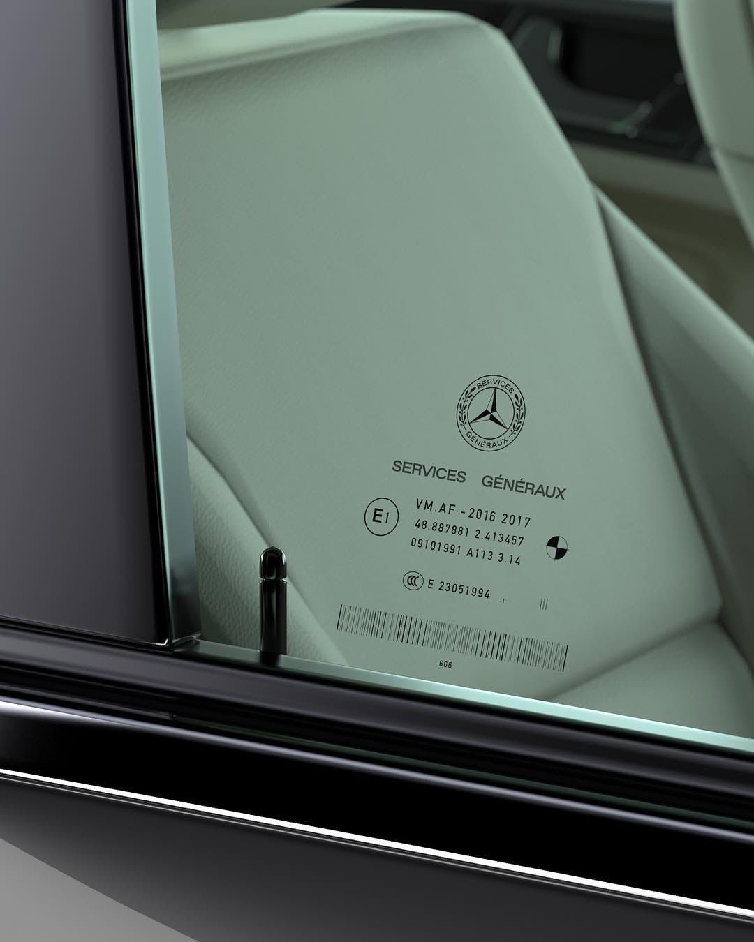
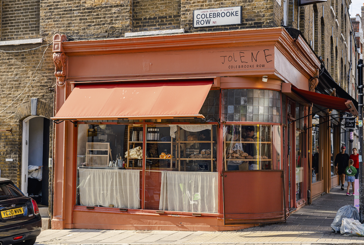
Designed to Be Ignored: Why Micro-Details Are Becoming the Most Important Part of Design
There’s a new kind of detail showing up more and more in design — the kind you don’t really notice at first. Tiny graphics. Technical markings. Small bits of text that look like they belong on something functional rather than something ...


.svg)