The Logo is Dead. Long Live the System.
For a while, branding has been obsessed with the perfect logo. Clean, minimal, recognisable — something that sits nicely in the top left corner and works at every size. Then came the reaction to that. Hand-drawn logos, scribbles, “imperfect” marks. Supposedly more human, more real. But now people are starting to see through that as well. It’s still designed. Still intentional. Just styled differently. So what’s next? It feels like we’re moving away from the idea that a brand needs one fixed logo at all.Instead, it’s becoming more about a system.
Take something like Yoshi Matcha Liqueur. They don’t rely on one strict logo. There are multiple variations — different layouts, different applications — but the name, colour, and overall feel are so consistent that it still reads as one brand. There’s a circular, slightly irregular graphic that appears across things, but it’s not treated like a traditional icon. It’s not precious. It’s just part of the language.

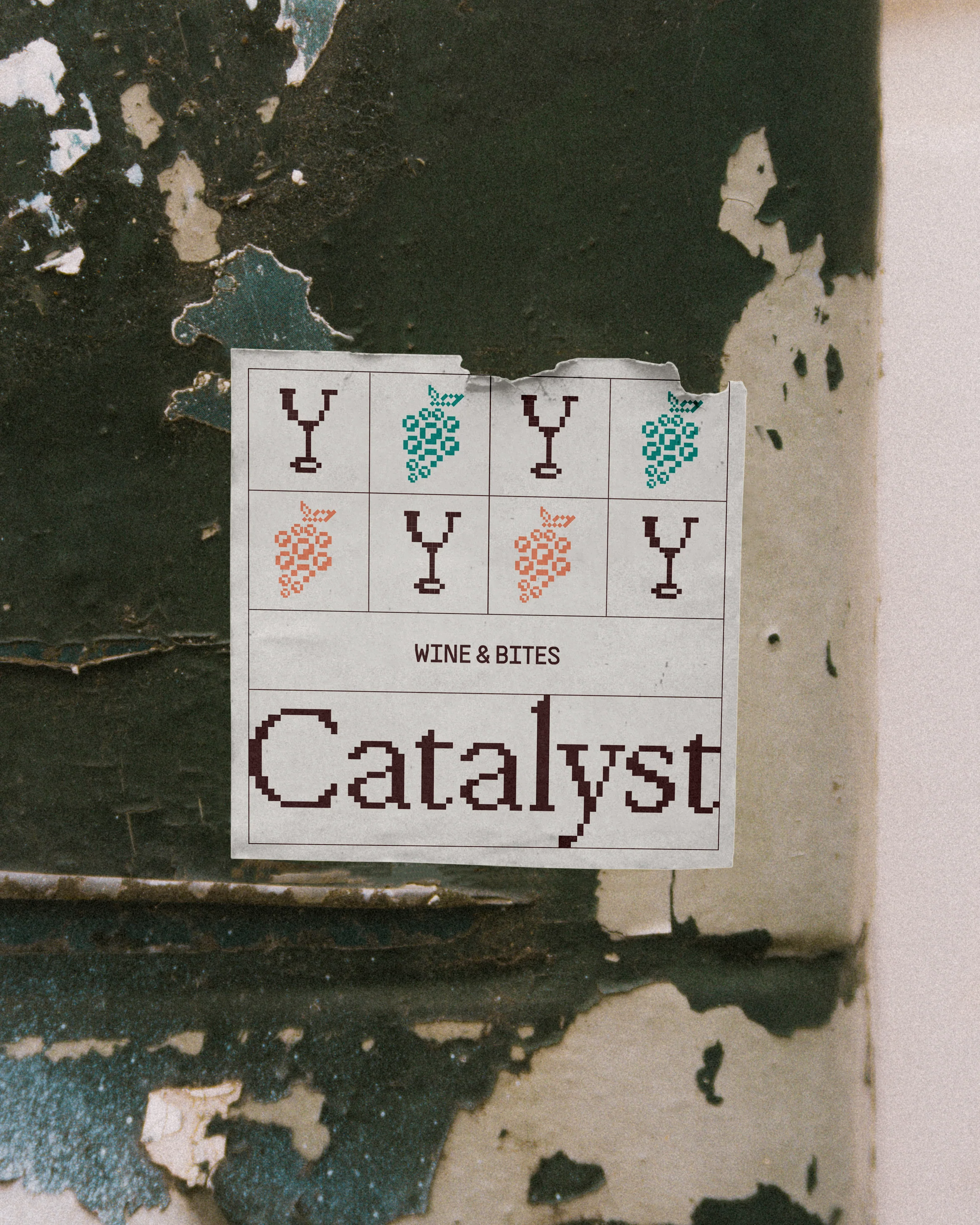
Or Catalyst Wines. The pixelated style becomes the identity. It doesn’t matter exactly what’s shown — as long as it follows that same visual logic, it’s recognisable. The “logo” is less of a fixed mark and more of a way of building things.
That’s the shift. Because the truth is, most people don’t actually recognise brands from a tiny icon alone. They recognise patterns. Colour, type, tone, layout — the overall feeling of something. So designing one perfect logo and expecting it to carry everything doesn’t really make sense anymore.A system does.
A system gives you flexibility. It lets a brand move, adapt, and exist across different spaces without breaking. It feels more natural, more suited to how things actually live now — across screens, packaging, content, and everything in between.It also feels more honest.Instead of pretending one small mark can define everything, you’re building a world around the brand, where everything contributes to recognition.
That doesn’t mean logos disappear completely. But they become less important. Less of a hero, more of a part.The interesting part is that this actually makes branding harder, not easier. You can’t rely on one strong mark to do the work — the whole system has to hold together.And when it does, you don’t need to ask “what’s the logo?”You already know what it is.

Written by: Zoe Earl — April 2026

.svg)